 Image: Nintendo Life
Hello folks, and welcome back to another edition of Box Art Brawl!
Last week, we checked out the Game Boy Advance version of Donkey Kong Country. It was a classic 3-way battle in which Japan managed to emerge victorious with 42% of the vote. Europe followed very closely with 39%, while North America floundered slightly at 19%.
This time, we're back with the Layton series with Professor Layton and the Miracle Mask. Released for the Nintendo 3DS in 2011 in Japan before a western release followed in 2012, it was the debut title for the 3DS and was followed by Azran Legacy in 2013. Like the rest of the series, it was relatively well received and enjoyed decent commercial success.
It's another 3-way brawl this week, so strap yourselves in, and let's get cracking.
Be sure to cast your votes in the poll below; but first, let's check out the box art designs themselves.
North America
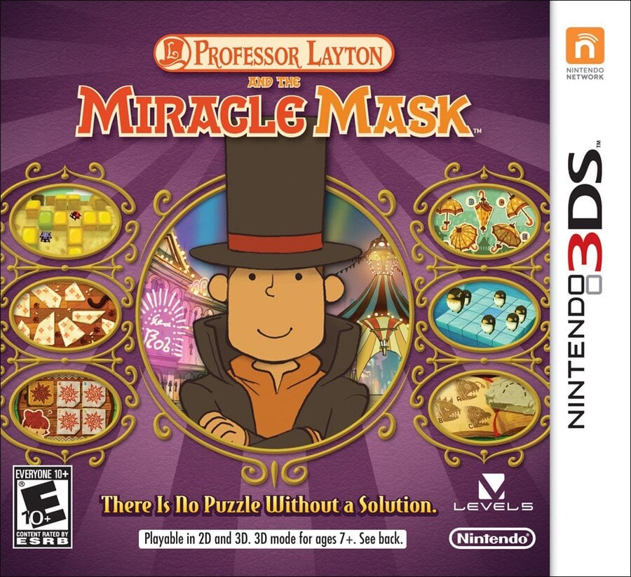 Image: Level-5 / Launch Box
All told, both western designs for Miracle Mask share some obvious similarities in terms on their composition. With the North American design, Layton's adorable face is given the top billing front and centre, with smaller images surrounding him in circular windows. It's a nice design!
Europe
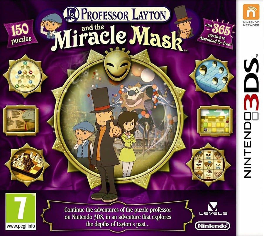 Image: Level-5 / Launch Box
Europe's design is similar, as we menitoned, but it's certainly a lot busier too. There are more windows showcasing images from the game, while Layton himself is joined by supporting characters in the centre of the piece. Overall, the background colour is a bit darker too, which does help make the images stand out.
Japan
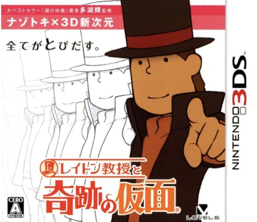 Image: Level-5 / Launch Box
Japan's design is undoubtedly more abstract, showcasing Layton pointing at the viewer, with afterimages of his character model spliced across the background. A white background too, mind. It's an odd choice, but... it kinda works? We like it.
Thanks for voting! We'll see you next time for another round of Box Art Brawl.

 4 months ago
126

![Anime Reborn Units Tier List [RELEASE] (November 2024)](https://www.destructoid.com/wp-content/uploads/2024/11/anime-reborn-units-tier-list.jpg)
