 Image: Nintendo Life
Hey everyone, welcome to another edition of Box Art Brawl!
Before we get cracking with this week's battle, let's see how things panned out last time. We took a look at Balloon Fight for the NES, a bonafide Joust-inspired classic from legendary developers such as Satoru Iwata and Yoshio Sakamoto. It was a close call on this one, but ultimately the pixel art black box seen in the US won the day with 42% of the vote. Japan managed 33%, while Europe scored 24%.
This week, we're sticking with the NES to look at another classic: Kid Icarus. Released in 1986 in Japan and 1987 in the west, Kid Icarus went on to become a true favourite amongst Nintendo fans. Masahiro Sakurai's 3DS sequel, Kid Icarus: Uprising, is also largely considered to be one of the handheld's best games.
It's another three-way brawl this week, and the participants share quite a bit in common with last week's Balloon Fight in terms of their overall approach. Let's get to it.
Be sure to cast your votes in the poll below; but first, let's check out the box art designs themselves.
North America
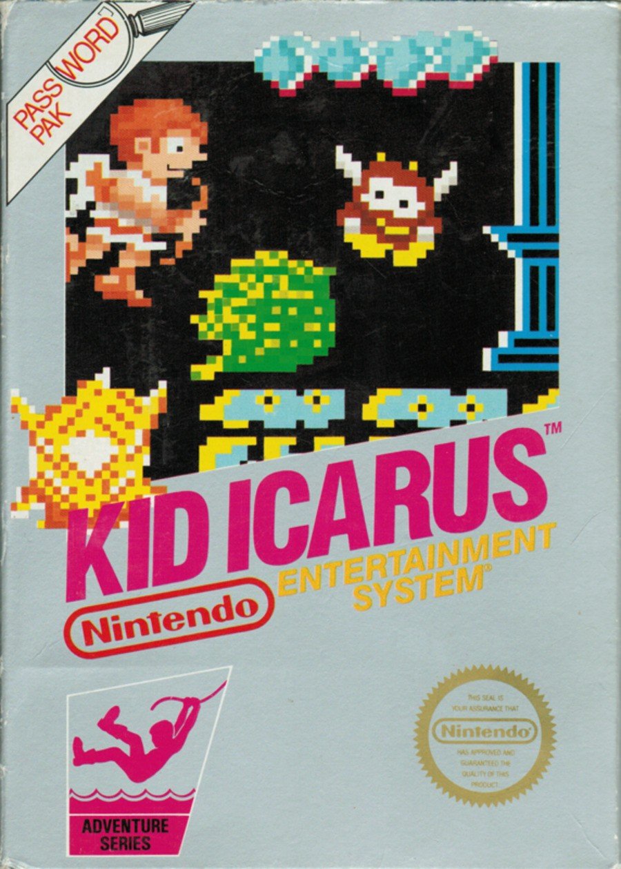 Image: Nintendo / Mobygames
So yes, this is very much the quintessential pixel art box design seen with many NES titles in the US. It's not quite the 'black box' we're used to, but the overall design is very familiar. It showcases the prospective gameplay quite well, and we're still really quite fond of that Pit sprite.
Europe
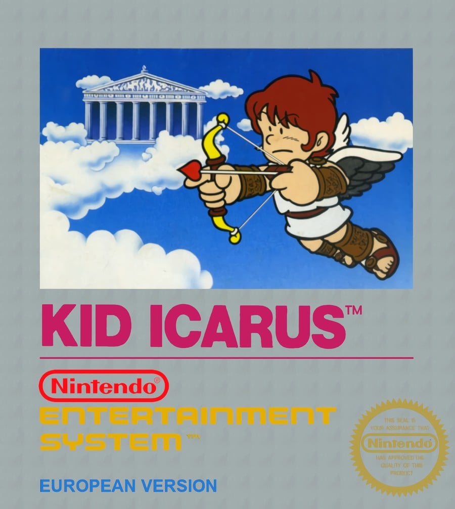 Image: Nintendo / Launch Box
We get a better look at Pit in this strangely tranquil image adorning the European box. Floating in mid air as he aims his trusty bow, Pit's design is certainly quite different from what we might be used to nowadays, but it's quite pleasant in its simplicity.
Japan
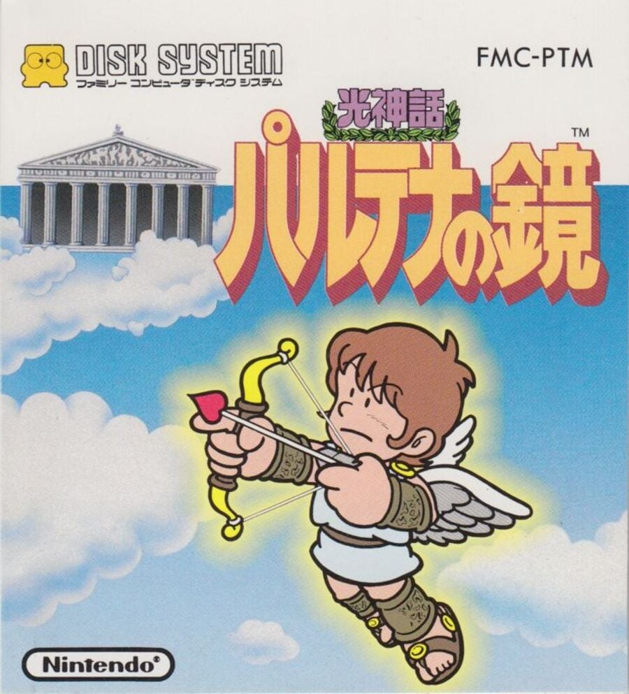 Image: Nintendo / Mobygames
Japan shares the same Pit image as its European counterpart, but get this... He's angled a bit more (inspired!) and he's been given an angelic yellow glow (resplendent!). The overall colour due is quite a bit lighter too, and we absolutely the japanese text used for the game's title. Lovely stuff.
Thanks for voting! We'll see you next time for another round of Box Art Brawl.

 2 months ago
84
![Anime Reborn Units Tier List [RELEASE] (November 2024)](https://www.destructoid.com/wp-content/uploads/2024/11/anime-reborn-units-tier-list.jpg)
