"It takes a lot of time"

- by Khayl Adam 8m ago
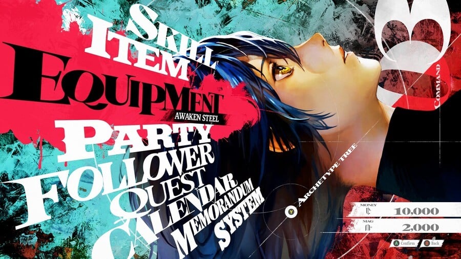
Astonishingly stylish, Atlus is currently the reigning champion in UI design, with its legendary Persona series scoring full marks in this regard. The imminent Metaphor: ReFantazio is no slouch in this department, either, and Studio Zero director Katsura Hashino was recently asked about its gorgeous menu design, and you can almost hear him audibly sigh.
Speaking to The Verge, Hashino says it's a relatively straightforward process, but it takes excessive work and time. The secret, he says, is that each separate menu page gets its unique design and must always remain simple, practical and usable: "This is actually really annoying to do. We have separate programs running for each of them as well. Whether it’s the shop menu or the main menu, when you open them up, there’s a whole separate program running and a separate design that goes into making it. It takes a lot of time."
Elaborating, the director says the studio benefits from "the know-how that we built up over the years" but admits that a lot of work goes into refining the designs. As an example, Hashino says the angular elements of Persona 5's menus were causing issues with legibility and were "impossible to read at first".

 1 month ago
60


![Anime Reborn Units Tier List [RELEASE] (November 2024)](https://www.destructoid.com/wp-content/uploads/2024/11/anime-reborn-units-tier-list.jpg)
